TL;DR

Get furniture and decor delivered free with Prime
- Fast, free delivery on millions of items
- Prime Video, Amazon Music and more included
- Member-only deals all year
Interior designers advise against painting living rooms bright reds and overly warm greens, citing issues with lighting and ambiance. These insights help homeowners choose more effective, inviting colors.
Interior designers warn that certain paint colors, particularly bright reds and overly warm green-yellows, are poor choices for living rooms due to their lighting and mood effects, according to a recent report by House Beautiful. Designers Say This Is The #1 Rule To Follow Before Choosing A Paint Color.
In a series of interviews with professional interior designers, several hues were identified as less desirable for living room walls. Meghan Shadrick, an interior designer, pointed out that green with warm yellow undertones often appears unattractive under artificial lighting, turning a putrid yellow-green at night. Similarly, Brooke Mennen-Talsma noted that stark gray or white tones can feel overly cold or flat, especially when they lean into cool, stark shades that lack warmth or depth. For tips on avoiding common interior design mistakes, see Designers Say These 11 Living Room Mistakes Give Guests The “Ick”.
Bright reds, while bold and vibrant, tend to be overwhelming when used on large surfaces in living rooms, according to Shadrick, who prefers using red as an accent rather than a primary wall color. Blair Burton added that using a client’s favorite color as a dominant wall hue can also be limiting, as it may overshadow other design elements and restrict the room’s versatility. Instead, she recommends incorporating favorite colors through textiles and accessories. If you want to improve your living room design, check out our tips on common mistakes to avoid.
Finish choice is also critical, with Mennen-Talsma advocating for low-sheen paints to create a softer, more forgiving backdrop that minimizes imperfections and enhances the depth of the chosen color. She suggests using slightly higher sheen on trim or millwork for contrast and easier cleaning.
Why Avoiding Certain Colors Improves Living Room Atmosphere
This advice is significant because choosing the right paint color can dramatically influence the ambiance, lighting, and overall feel of a living room. Avoiding problematic hues like overly warm green-yellows and bright reds can prevent spaces from feeling unwelcoming or overwhelming. Instead, opting for muted, balanced tones fosters a more inviting and versatile environment, which is essential for creating a comfortable living space that can adapt to various styles and moods.
As an affiliate, we earn on qualifying purchases.
Color Trends and Common Pitfalls in Living Room Design
Over recent years, interior design has shifted away from stark, overly cool neutrals and bold, overwhelming colors in living rooms. While neutral tones remain popular for their versatility, designers caution against certain hues that can underperform under typical lighting conditions. The advice reflects a broader trend towards more nuanced, balanced color palettes that enhance natural light and create cozy, inviting spaces.
Previous trends, such as the ‘millennial gray,’ have fallen out of favor, with experts now emphasizing muted, muddy colors that feel more collected and lived-in. The current guidance aims to help homeowners avoid costly mistakes that can undermine the comfort and aesthetic appeal of their main living areas.
“In the evening, artificial light is the only light source, and light bulbs tend to turn green-yellows even more yellow and almost always go putrid in tone.”
— Meghan Shadrick
Unconfirmed Aspects of Color Choices in Living Rooms
It is not yet clear whether these recommendations apply universally across different lighting environments and personal preferences. The impact of specific shades may vary depending on room size, lighting conditions, and existing decor, so individual experiences could differ.
Next Steps for Homeowners Choosing Living Room Colors
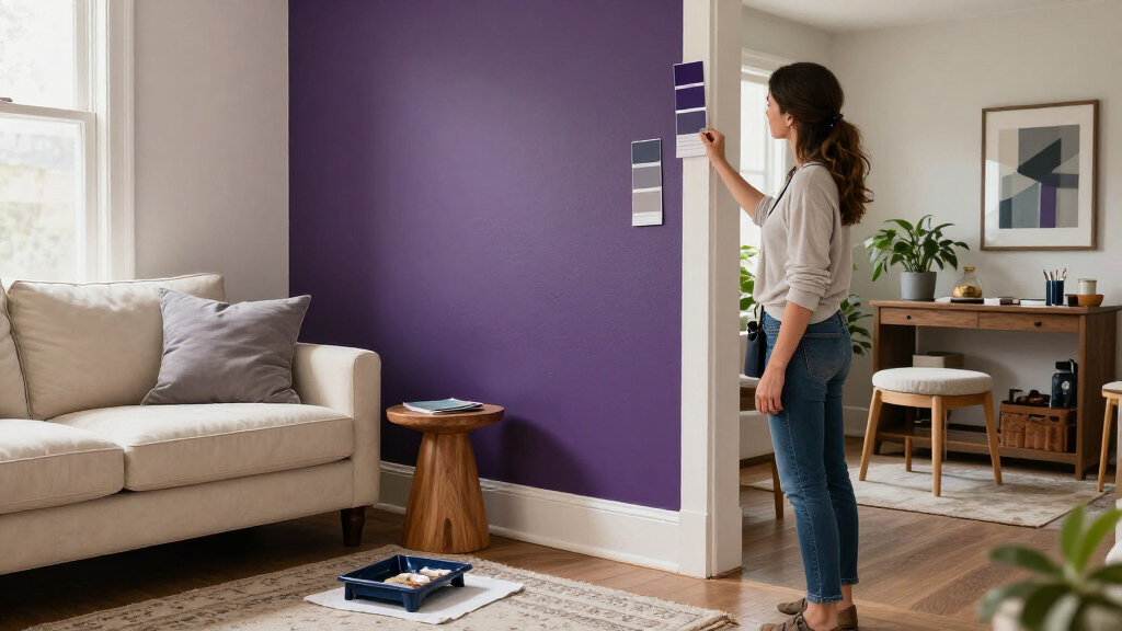
Homeowners should consider testing paint samples under different lighting conditions before committing to a color. Consulting with interior designers or color specialists can also help tailor choices to specific spaces. Future trends may further refine which hues are most suitable for creating comfortable, adaptable living rooms.
Key Questions
Why are bright reds not recommended for living rooms?
Bright reds can be overwhelming when used on large surfaces, creating a sense of intensity that may be uncomfortable or visually exhausting, according to interior designers.
Are all green-yellows bad for living rooms?
Not necessarily. Green with cooler undertones can work well, but ultra-warm, yellow-leaning greens tend to look unflattering under artificial light, which is common in living rooms.
What finishes are best for living room walls?
Low-sheen finishes are preferred for their softness and ability to hide imperfections, while slightly higher sheen on trim can add contrast and durability.
Can I use my favorite color on my living room walls?
Experts recommend against using a favorite color as the main wall hue, suggesting instead to incorporate it through textiles or accents to maintain flexibility and visual interest.
Source: rss
Halloween Picks
halloween
As an affiliate, we earn on qualifying purchases.