August's vibrant color palettes can truly make your home pop! Try combining warm oranges and yellows for a lively atmosphere. You can also use the Rosy August palette with dusty rose and bright pink to create a cozy yet charming vibe. Don't forget to incorporate bold accents like colorful throw pillows or artwork to brighten your space. Layering different textures adds depth, while soft neutrals balance vibrant hues. Want to embrace nature-inspired tones? Look into sandy beiges or earthy terracotta. There's plenty more to explore in August color inspirations that can transform your home beautifully!
Key Takeaways
- Embrace vibrant oranges and yellows for a lively August atmosphere, bringing warmth and energy to your spaces.
- Pair warm hues with neutral shades like soft beige or warm gray to create balance and visual interest.
- Introduce teal or turquoise accents for a refreshing coastal vibe that contrasts beautifully with warm colors.
- Utilize terracotta and olive green tones for a rustic, earthy charm that enhances a cozy retreat feel.
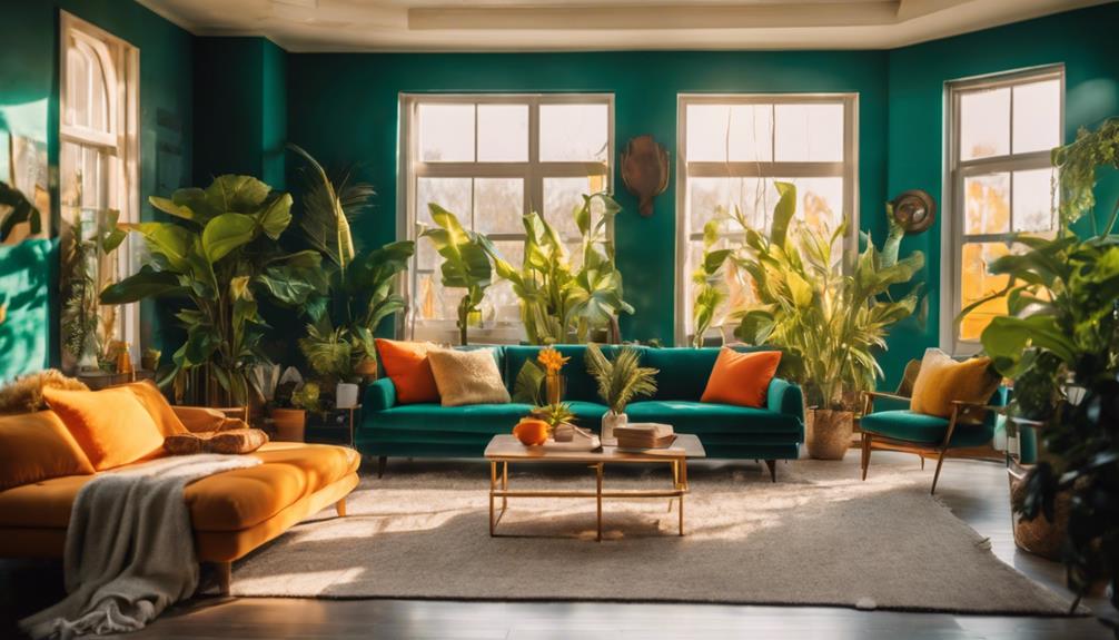
Vibrant August Color Inspirations
As you immerse yourself in August, consider brightening your space with vibrant color palettes that capture the essence of summer. One fantastic option is the Sunny Flight Palette, where golden tones meet dewy blues. This paint color scheme brings warmth and brightness, making any room feel inviting and cheerful.
If you're looking for something invigorating, try the Peri Palette. Combining periwinkle blue and leafy greens, this color palette enhances relaxation and creates a cool summer vibe, perfect for your living room or bedroom.
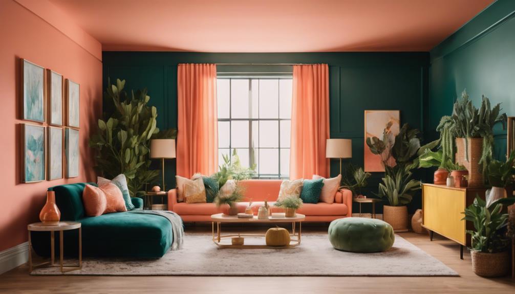
For a touch of vintage charm, the Rosy August Palette is ideal. Dusty rose hues paired with bright pink infuse character into your space, easily transforming it into a cozy retreat.
Don't forget to draw inspiration from your garden! Nature offers a rich tapestry of vibrant colors that can seamlessly translate into your home decor. By using the hashtag #GardenGirlStudioPalette, you can connect with fellow design enthusiasts and share your color palette creations.
Embrace these vibrant inspirations this August, and watch your home come alive with energy and warmth!
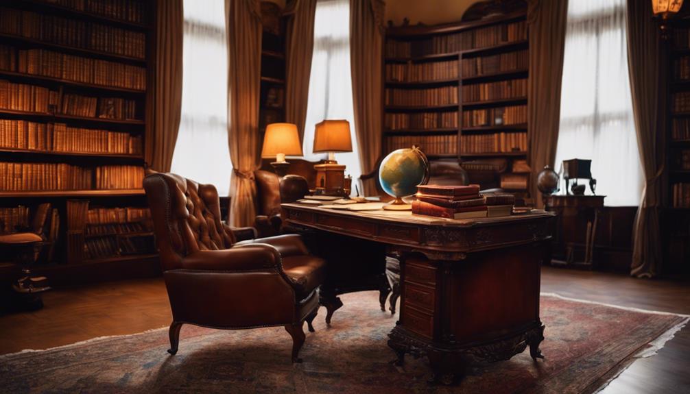
Warm Hues for Cozy Spaces

Bright colors can energize your space in August, but as the seasons shift, warm hues like golden yellows and rich reds become perfect for creating cozy atmospheres in your home. These colors evoke comfort and warmth, making your living room or bedroom feel inviting and snug.
To effectively incorporate warm hues, consider painting an accent wall in terracotta or burnt sienna. These tones add depth without overwhelming the space. Layering these vibrant colors with neutral tones, such as creams and taupes, helps balance the overall aesthetic. This combination maintains vibrancy while ensuring your home feels harmonious and cohesive.
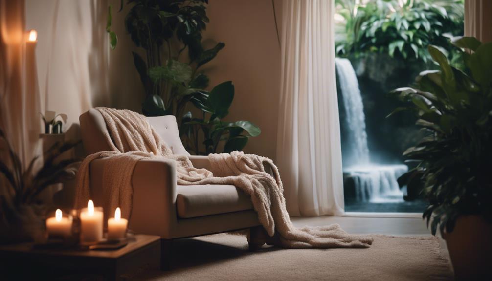
Don't forget to enhance the cozy atmosphere with textured fabrics. Plush throws in warm colors not only contribute to the inviting vibe but also complement the overall color palette beautifully. You can use rich reds and deep oranges in your decor to keep the energy flowing while still feeling snug.
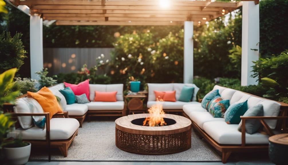
Bold Accents to Brighten Rooms

To brighten up your rooms, consider using bold accents like colorful throw pillows, vibrant artwork displays, and statement rugs.
These elements not only add energy but also make it easy to refresh your space.
Colorful Throw Pillows
Colorful throw pillows instantly elevate your space, adding bold accents that breathe new life into any room. By incorporating vibrant hues like peacock blues or sunny yellows, you can create focal points that organically draw the eye, enhancing your overall color palette.
Mixing and matching various patterns and textures in your throw pillows adds depth and visual interest, making your space feel cozier and more inviting. This effortless update allows you to switch up your decor seasonally, keeping your home feeling fresh and stylish all year round. Whether you want a pop of color or a subtle touch, these pillows are an easy way to achieve your desired look.
For a cohesive color scheme, consider using warm oranges or calming greens that harmonize with your furniture and other decorative elements. This approach ties everything together, creating a balanced aesthetic that's pleasing to the eye.
With colorful throw pillows, you can experiment and express your personal style without a hefty investment, making them a perfect choice for any home makeover. So go ahead, have fun mixing and matching to find the perfect combination that resonates with you!
Vibrant Artwork Displays
Incorporating vibrant artwork displays transforms your space into a lively atmosphere that captures attention and sparks joy.
Bold colors in large canvas pieces or striking framed prints can instantly elevate any room, making it feel more inviting and dynamic. When selecting your artwork, consider mixing styles like abstract, geometric, or nature-inspired pieces; this adds visual interest while keeping a cohesive color palette that complements your existing paint.
Position your artwork at eye level to guarantee maximum impact, allowing everyone to appreciate the colors and details. Surrounding your artworks with neutral tones or lighter shades can help them pop even more, creating a stunning focal point in the room.
To keep your space feeling fresh, think about rotating your artwork seasonally. This not only reflects current design trends but also adds an engaging element to your home that can brighten your mood.
By thoughtfully integrating vibrant artwork displays, you're not just decorating; you're creating a personalized haven where colors and creativity come together to enhance your living experience.
Statement Rugs Selection
Statement rugs can serve as striking focal points that not only bring bold accents to your space but also enhance the overall ambiance and color palette of your room. When you choose a rug with vibrant colors or intricate patterns, you instantly brighten the area and tie together various design elements.
It's important to select statement rugs made from durable materials, such as wool or synthetic fibers, ensuring they can withstand daily wear while still delivering style.
Consider the size and shape of the rug to complement your furniture layout effectively; a well-placed rug can unify the space without overwhelming it. Layering a statement rug over a neutral carpet or flooring adds texture and depth, creating a visually appealing contrast that draws the eye.
When you invest in a statement rug, think about how it reflects your personality and ties in with the rest of your decor. With the right choice, these bold accents can transform your living space into a vibrant retreat, making it both inviting and stylish.
Don't hesitate to experiment with different designs until you find the perfect fit for your home!
Layering Textures for Interest

When you layer textures in your home, you're adding a unique dimension that can elevate your color palette.
Think about how textured fabrics, natural materials, and layered patterns can work together to create depth and visual interest.
Textured Fabrics Selection Techniques
Layering different textured fabrics like velvet, linen, and cotton can instantly elevate your room's aesthetic and create an enchanting visual depth. By thoughtfully combining these materials, you can enhance comfort while adding visual interest to your space.
Here are three techniques to ponder:
- Mix Finishes: Incorporate various textures with different finishes—matte, shiny, and ribbed—to create complexity and intrigue. This variation draws the eye and keeps the design engaging.
- Use a Monochromatic Color Palette: Sticking to a single color scheme allows you to focus on the textures without overwhelming the room. A range of shades in your chosen color can provide sophistication while preventing the space from feeling flat.
- Balance Textures: Pair soft fabrics, like a plush throw, with sleek materials, such as leather. This balance not only promotes comfort but also adds layers of depth to your decor.
Mixing Natural Materials Effectively
Mixing natural materials like wood and stone not only adds depth to your space but also creates a warm, inviting atmosphere that feels both stylish and comfortable. When you layer different textures, you enhance the visual interest in your home. For instance, consider pairing a woven rattan chair with a smooth leather sofa. This combination balances the room while inviting guests to relax.
Don't forget about finishes! Mixing matte and glossy surfaces can highlight architectural features, adding complexity to your design. A light wood table with dark metal accents creates a striking contrast that draws the eye and elevates your overall aesthetic.
Incorporating natural fibers, like cotton and linen in throw pillows or curtains, softens hard surfaces and promotes a cozy environment. These elements work harmoniously with other materials, creating a cohesive look throughout your space.
Layering Patterns for Depth
Combining different patterns can add visual depth to your space, enriching the overall aesthetic while maintaining a cohesive look. When you're layering patterns, consider these tips:
- Vary the Scale: Use large prints on curtains and smaller prints on cushions. This contrast keeps the design interesting without overwhelming the eye.
- Limit Your Palette: Stick to three or four patterns that share a common color palette. This guarantees harmony and prevents chaos in your decor.
- Incorporate Textures: Mix natural materials like wood and woven fabrics with patterned textiles. This combination enhances the tactile experience and adds warmth to your room.
Seasonal Color Combinations

August's warm and vibrant color combinations can transform your home into an energetic oasis, reflecting the late summer sun. To capture this lively atmosphere, think about incorporating rich oranges and yellows that echo the season.
Pair these vibrant accent colors with neutral shades like soft beige or warm gray to create balance, allowing the seasonal hues to shine without overwhelming your space.
For a rejuvenating twist, consider adding shades of teal or turquoise. These colors evoke a coastal vibe, providing a cool contrast to the warm tones typical of this time of year. If you prefer something more earthy, terracotta and olive green can harmonize beautifully with your surrounding landscape, promoting a rustic charm.
Don't shy away from bold combinations either! Deep purples paired with bright pinks can create a striking statement that captures the essence of summer blooms.
Techniques for Harmonious Design
To create a harmonious design in your home, you can start by utilizing a color wheel to identify complementary and analogous colors that suit your style.
Understanding how colors affect mood and atmosphere will guide your choices, ensuring they resonate with the ambiance you want to achieve.
Don't forget to test your color combinations in different lighting to see how they interact with your space!
Color Wheel Applications
Understanding color wheel applications can transform your home into a harmonious haven that reflects your personal style. By mastering these techniques, you can effectively balance warm vs. cool colors and create a space that feels both inviting and cohesive.
Here are three key approaches to take into account:
- Analogous Color Scheme: Use colors adjacent on the color wheel, like blue, blue-green, and green. This creates a calm and cohesive atmosphere perfect for relaxation.
- Complementary Color Scheme: Pair opposites, such as orange and blue, to generate vibrant contrast and dynamic visual interest. This technique is great for energizing a room.
- Monochromatic Scheme: Vary shades and tints of a single color, like different blues, to achieve a unified and sophisticated look throughout your home.
Don't forget about testing color combinations! Experiment with sample paints on foam boards to visualize how different hues interact in your space before committing to a final choice.
This hands-on approach guarantees your selections align with your desired mood and aesthetic, making your home truly yours.
Mood and Atmosphere
Creating the right mood and atmosphere in your home starts with selecting colors that resonate with your emotions and enhance your living space. Understanding how different colors affect your mood can help you design an environment that feels just right. For instance, warm colors like orange and red energize, while cool colors such as blue and green promote relaxation.
To achieve a harmonious atmosphere, consider using analogous colors from the color wheel. This approach creates a cohesive look across your rooms. You can also explore a monochromatic scheme by incorporating various shades of a single color, enhancing visual interest while maintaining unity.
Here's a quick reference table to help you choose colors based on the mood you want to set:
| Mood | Suggested Colors | Effect |
|---|---|---|
| Energizing | Orange, Red | Boosts energy and creativity |
| Calming | Blue, Green | Promotes tranquility |
| Inviting | Yellow, Soft Pastels | Creates warmth and comfort |
Testing Color Combinations
Testing various color combinations allows you to discover what works best for your space and personal style. By experimenting with different hues, you can create an atmosphere that resonates with you.
Here are three techniques to help you accomplish harmonious design:
- Color Wheel Magic: Use the color wheel to identify analogous colors. These adjacent shades can create a harmonious and relaxing atmosphere, enhancing your overall design.
- Complementary Colors: Don't shy away from testing complementary colors. This approach introduces vibrant contrasts that energize a room and highlight focal points, making your space feel dynamic.
- Sample Boards: When selecting paint colors, always test them on sample boards. Observe how they look under various lighting conditions to verify they achieve your desired effect.
Incorporating a balance of warm and cool tones can elevate your palette, as warm colors evoke energy while cool tones promote calmness. Alternatively, consider a monochromatic scheme with varying shades of a single color for a sophisticated look.
Effective Use of Neutrals

Neutrals act as a versatile canvas that lets your bold colors shine while maintaining a balanced and inviting atmosphere. By choosing popular neutral shades like warm whites, soft grays, and beige, you can create a calming backdrop that enhances the overall aesthetic of your space.
When you use these neutral tones in larger areas, such as walls and larger furniture pieces, you allow vibrant accents to pop in smaller decor items, achieving a cohesive look throughout your home.
Additionally, utilizing clean white can enhance natural light in a room, making your spaces feel larger and more welcoming. This seamless flow between different areas is essential for a harmonious design.
Don't forget about the power of layering different textures and shades of neutrals. By incorporating various materials, such as soft fabrics, smooth ceramics, and rustic wood, you can create depth and interest, preventing a flat appearance.
This approach not only adds character to your design but also maintains the soothing qualities of your chosen neutral palette. Embrace the beauty of neutrals, and watch your bold colors shine!
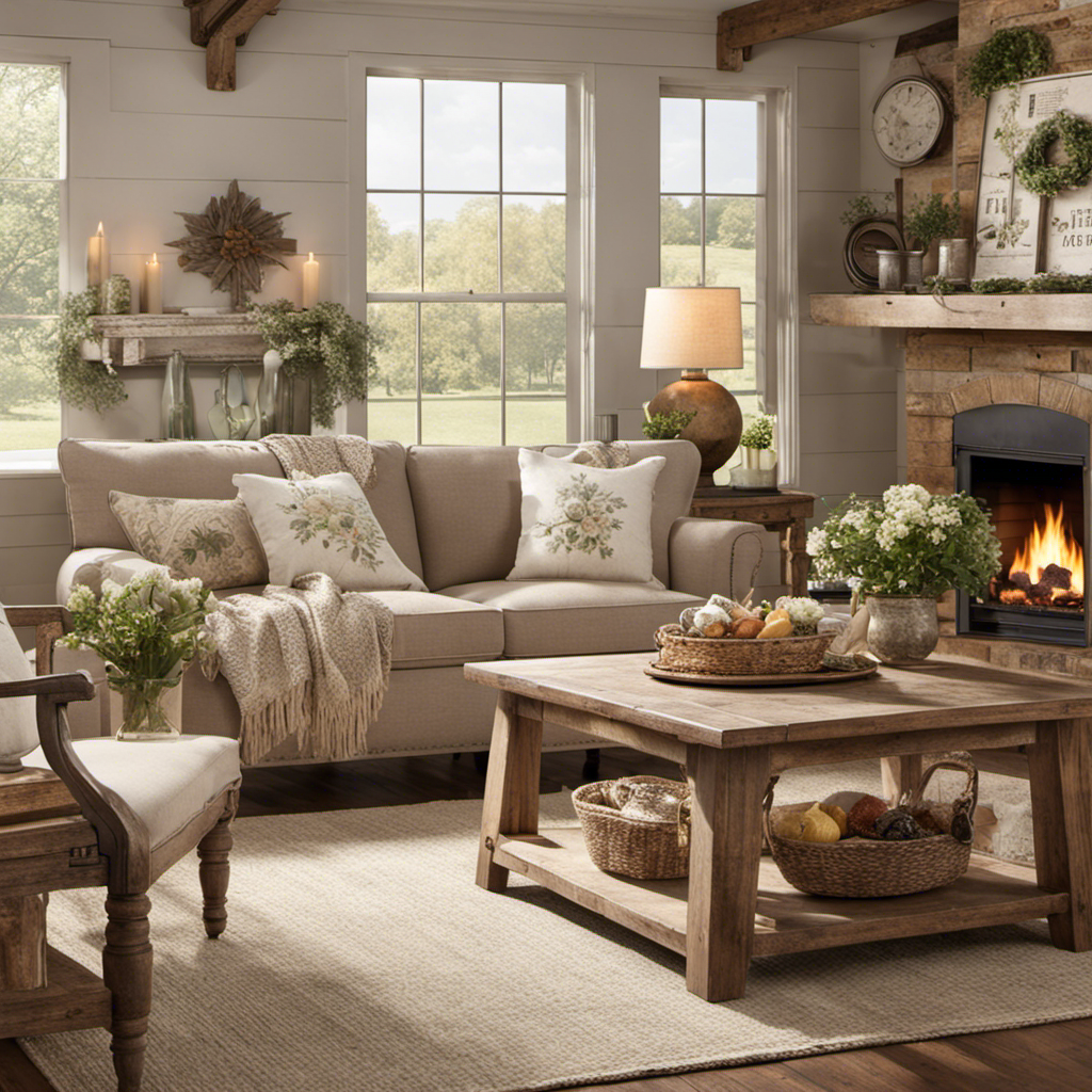
Incorporating Nature-Inspired Tones

Incorporating nature-inspired tones into your home can transform your space into a serene retreat that fosters relaxation and connection with the great outdoors. These colors, such as earthy browns and soft greens, create a calming atmosphere that invites tranquility.
To effectively incorporate these tones, consider the following:
- Choose a Color Palette: Opt for shades that reflect nature, like sandy beiges, muted peaches, or oceanic teals. These colors evoke the peacefulness of a natural landscape and enhance your home's mood.
- Embrace Seasonal Changes: Integrate warm golden yellows or rich burgundies to capture the essence of August sunsets. This approach adds warmth and makes your home feel inviting.
- Add Texture with Plants: Use plants and botanical prints alongside your chosen colors. They not only complement your nature-inspired tones but also add depth and reinforce your connection to the outdoors.
Enhancing Spaces With Accessories

How can you elevate your home's aesthetic? Enhancing spaces with thoughtfully selected accessories can infuse vibrant hues and textures that breathe life into your environment.
Start by incorporating colorful accessories like throw pillows, rugs, and artwork. These elements can effortlessly introduce vibrant color without overwhelming the space.
Consider mixing different textures and patterns in your accessories to enhance visual interest. This approach creates a cohesive look, ensuring that the various colors complement rather than clash.
Seasonal accessories, such as floral arrangements or decorative vases, can reflect the current month's color palette, bringing a fresh and inviting atmosphere to your home.
Don't forget to include statement pieces, like a bold lamp or an oversized artwork. These focal points draw attention and tie together your overall color scheme.
By utilizing accessories in varying shades of your chosen palette, you can create depth and dimension, making your space feel dynamic and thoughtfully designed.
With the right accessories, you'll not only enhance your home's aesthetic but also create a vibrant, welcoming environment that truly reflects your style.
Real-Life Color Palette Examples

Real-life color palettes can transform your home's atmosphere, making it feel new and inviting. Here are three stunning color combinations you might consider for your home decor this August:
- Sunny Flight Palette: This vibrant mix of golden tones and dewy blues brightens up any space, perfect for a cheerful summer vibe. Imagine this in your living room or kitchen to reflect the sunny days outside.
- Peri Palette: Combining periwinkle blue with leafy greens creates a rejuvenating atmosphere. This cool color combination works wonders in bedrooms or living rooms, bringing a touch of nature indoors.
- Rosy August Palette: Dusty rose hues paired with bright pink lend a vintage charm, ideal for dining areas or accent walls. This palette can evoke warmth and elegance, inviting guests to linger a little longer.
Frequently Asked Questions
What Colors Look Good in August?
In August, you'll love warm hues like deep oranges and golden yellows. Earthy tones, bright accents, and soft pastels also work well, creating a vibrant yet calming atmosphere that reflects the beauty of summer.
What Colors Do You Associate With August?
You might associate August with warm golden yellows, rich oranges, and vibrant greens. Deep blues can evoke invigorating skies, while earthy browns ground you in nature, and bright pinks capture the playful essence of summer blooms.
How Do I Choose a Color Palette for My New Home?
Choosing a color palette for your new home's like picking a wardrobe for your walls. Start with your favorite hues, explore complementary shades, and test samples in various lights to find your perfect match.
What Are the Best Colors for August Wedding?
For your August wedding, consider vibrant coral, sunflower yellow, and deep burgundy for warmth. Earthy tones like terracotta and olive green create romance, while jewel tones add elegance, and pastels offer a soft, dreamy atmosphere.
Can the August Color Palettes Be Used to Enhance the Look of an Ugly Beige Bathroom Sink in a Farmhouse Style Bathroom?
Looking to amp up your farmhouse style bathroom? Consider an ugly beige bathroom sink integration with the August color palettes. With a mix of warm, earthy tones and rustic accents, these palettes can effortlessly enhance the look of your sink, adding a fresh and inviting vibe to the space.
Conclusion
As you embrace these vibrant August color palettes, remember that colors can transform your space in remarkable ways.
Did you know that rooms painted in warm hues can increase feelings of comfort and even boost mood by 30%?
So, go ahead and experiment with bold accents and nature-inspired tones.
By layering textures and incorporating accessories, you'll create a home that not only pops but also feels inviting and alive, making every moment at home even more enjoyable.